How to Prepare Artwork for Print Without Costly Reworks
17 June 2026 · By GraphicTech.mu
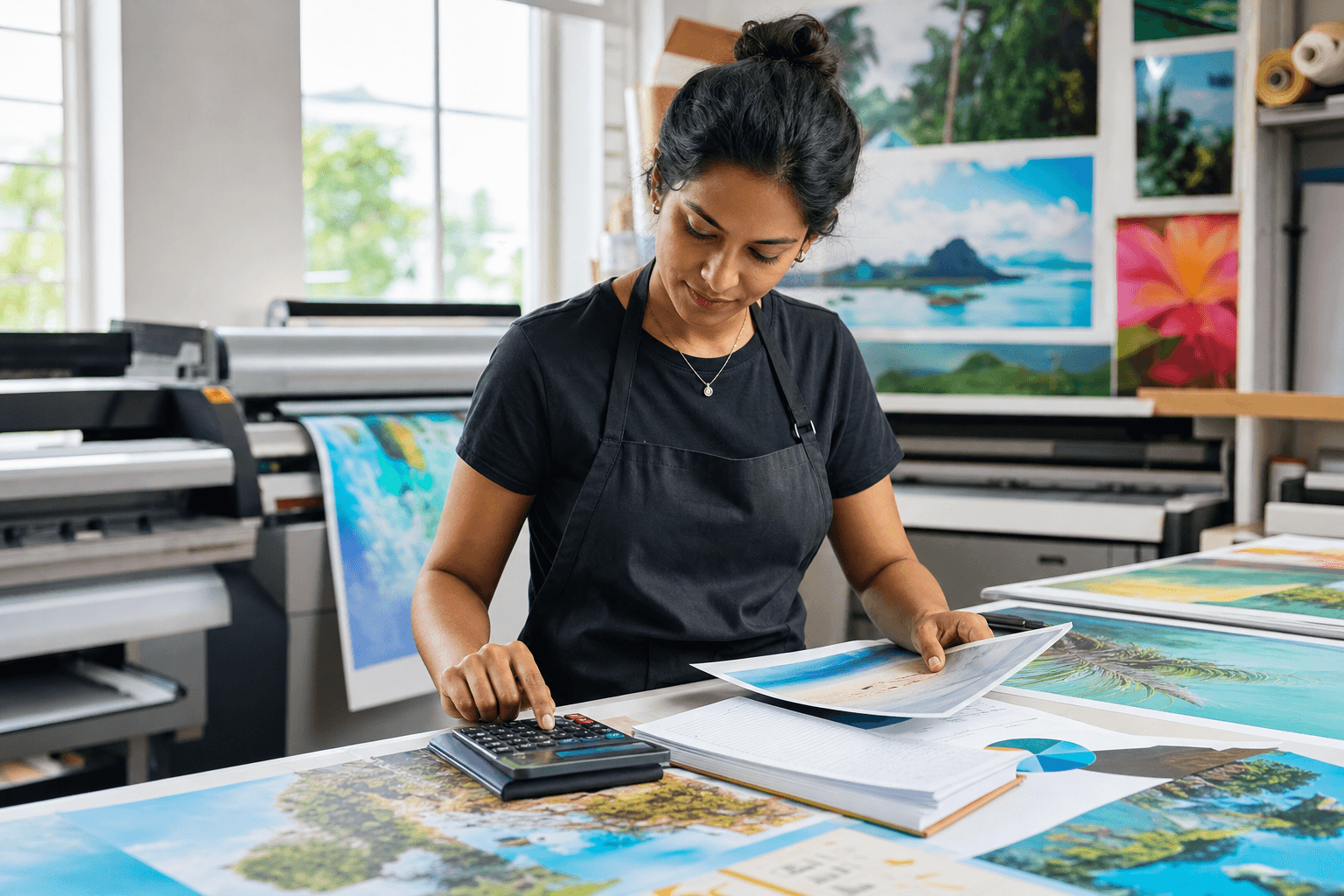
Why artwork preparation matters
Most print problems do not start at the press, they start in the file. A logo that looks fine on screen can print soft, a flyer can be trimmed too tightly, and a colour that looks bright on a monitor can shift once it hits paper, vinyl, or fabric. For printers and clients alike, good artwork preparation saves time, reduces waste, and improves profit margins.
If you produce signage, garments, labels, or promotional products, a simple preflight routine can prevent the most common rework issues. The goal is not perfection for its own sake, it is to make sure the file is technically ready for the chosen print process.
Start with the right setup
Before designing, confirm the final size, the printing method, and the finishing method. A business card, a vehicle decal, and a sublimation mug all have different technical needs.
Ask these questions early:
- What is the final finished size?
- Will the design be cut, stitched, folded, laminated, or trimmed?
- Is the output for digital print, solvent, UV, screen print, heat transfer, or sublimation?
- Will the printer need crop marks, registration marks, or white ink layers?
This matters because the file should be built for the real job, not adapted at the last minute. A design created at the wrong size or without enough bleed is one of the fastest ways to lose time.
Use the correct resolution
Image quality depends heavily on resolution. For most print work, 300 dpi at final size is a safe standard for photographs and detailed artwork. For large format jobs viewed from a distance, lower effective resolution may still be acceptable, but the file should still be sharp enough for the viewing distance and output method.
A useful rule is simple, the closer the viewing distance, the higher the resolution required. A poster seen at arm’s length needs more detail than a billboard seen from across the road.
Check for these common issues:
- Web images saved at 72 dpi and enlarged for print
- Screenshots used as logos
- Low-resolution PNGs pulled from social media
- Bitmaps that have been stretched beyond their native size
When in doubt, request the original vector logo or the highest-resolution source file available.
Keep logos and line art in vector format
Logos, icons, text-based marks, and simple illustrations should ideally be vector files. Vectors scale cleanly without pixelation, which makes them the best choice for signage, embroidery artwork, decals, and many printed products.
Common vector formats include AI, EPS, PDF, and SVG. A PDF is often the most practical delivery format because it can contain vector elements, embedded fonts, and colour information in one file.
Avoid rasterising logos unless absolutely necessary. Once a logo becomes a pixel image, it loses flexibility and can look fuzzy when enlarged.
Build with bleed and safe margins
Bleed is extra artwork that extends beyond the trim edge, usually 3 mm to 5 mm for small print items, and sometimes more for larger jobs depending on the printer’s workflow. It helps prevent white edges if trimming is slightly off.
Safe margin is the opposite concept, it is the area inside the trim line where important text and logos should stay. Keeping critical elements away from the edge protects them from being cut or hidden by finishing.
A good practice is:
- Add bleed on all sides
- Keep important text inside a safe zone
- Extend backgrounds, colours, and images into the bleed
- Do not place borders too close to the trim edge, because minor trimming shifts can make them look uneven
For stickers, tags, and shaped cuts, this step becomes even more important because the cut line may follow a custom contour rather than a simple rectangle.
Use colour intentionally
Colour is one of the biggest sources of client disappointment, especially when expectations are based on a screen. Monitors display light, print uses ink or toner, so colours will not match perfectly by default.
To improve consistency:
- Work in CMYK when preparing standard print files
- Use spot colours when exact brand matching is required and the print process supports them
- Ask for a Pantone reference if the brand has one
- Soft proof when possible, especially for critical brand work
Be careful with very bright RGB colours, neon shades, and saturated blues or greens. These often look stronger on screen than they can in print. If the job is colour critical, request a printed proof or test swatch before full production.
Outline fonts or embed them properly
Missing fonts can break a layout instantly. If a file opens on another computer and the required fonts are not installed, the text can reflow, change style, or disappear.
To avoid that:
- Outline fonts before sending print files, if editable text is no longer needed
- Or embed the fonts in a print-ready PDF when the workflow allows it
- Avoid using obscure fonts unless they are supplied with the job
Also check readability. A font that looks elegant on screen may become too thin or too small in final print, especially on fabric, stickers, or small labels.
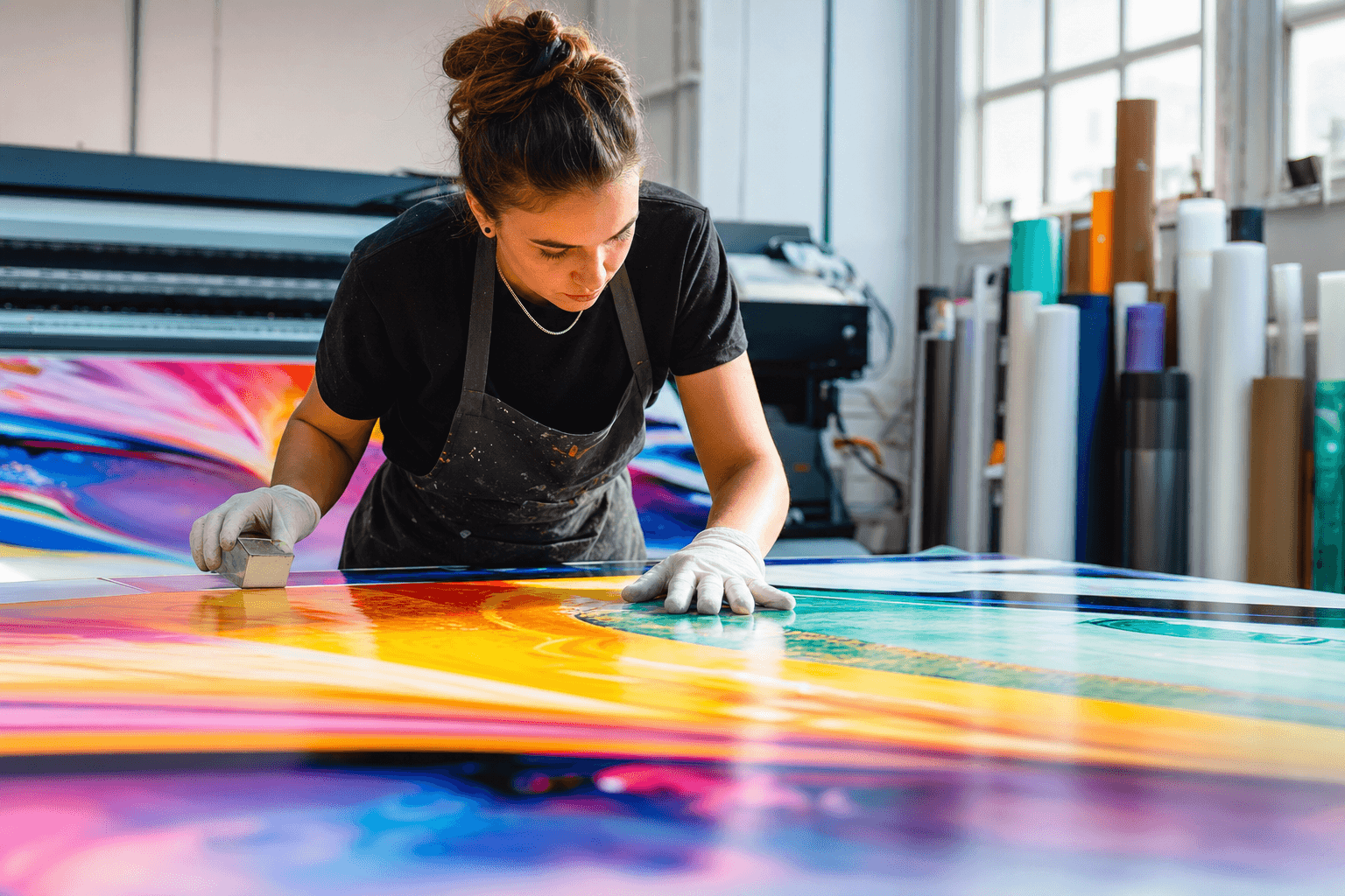
Flatten transparencies and check overprints
Modern design software uses transparency effects, shadows, glows, and blending modes. These can print beautifully, but they can also cause unexpected results if not exported correctly.
Before sending a file, inspect:
- Drop shadows that may rasterise at low quality
- Transparent objects overlapping spot colours
- Overprint settings that can hide objects unexpectedly
- Thin white text sitting on a transparent or coloured background
Exporting to a print-ready PDF from a trusted workflow usually handles many of these issues well, but a final preview is still essential.
Choose the right export settings
A carefully prepared file can still fail if exported incorrectly. PDF is the most common delivery format for print, but the settings matter.
A practical checklist:
- Export at final size
- Include bleed if requested
- Embed images at appropriate resolution
- Embed or outline fonts
- Use a printer-friendly PDF preset when available
- Avoid unnecessary compression that can soften artwork
If the printer provides a preferred file preset, use it. Standardising export settings reduces back-and-forth and helps production run more smoothly.
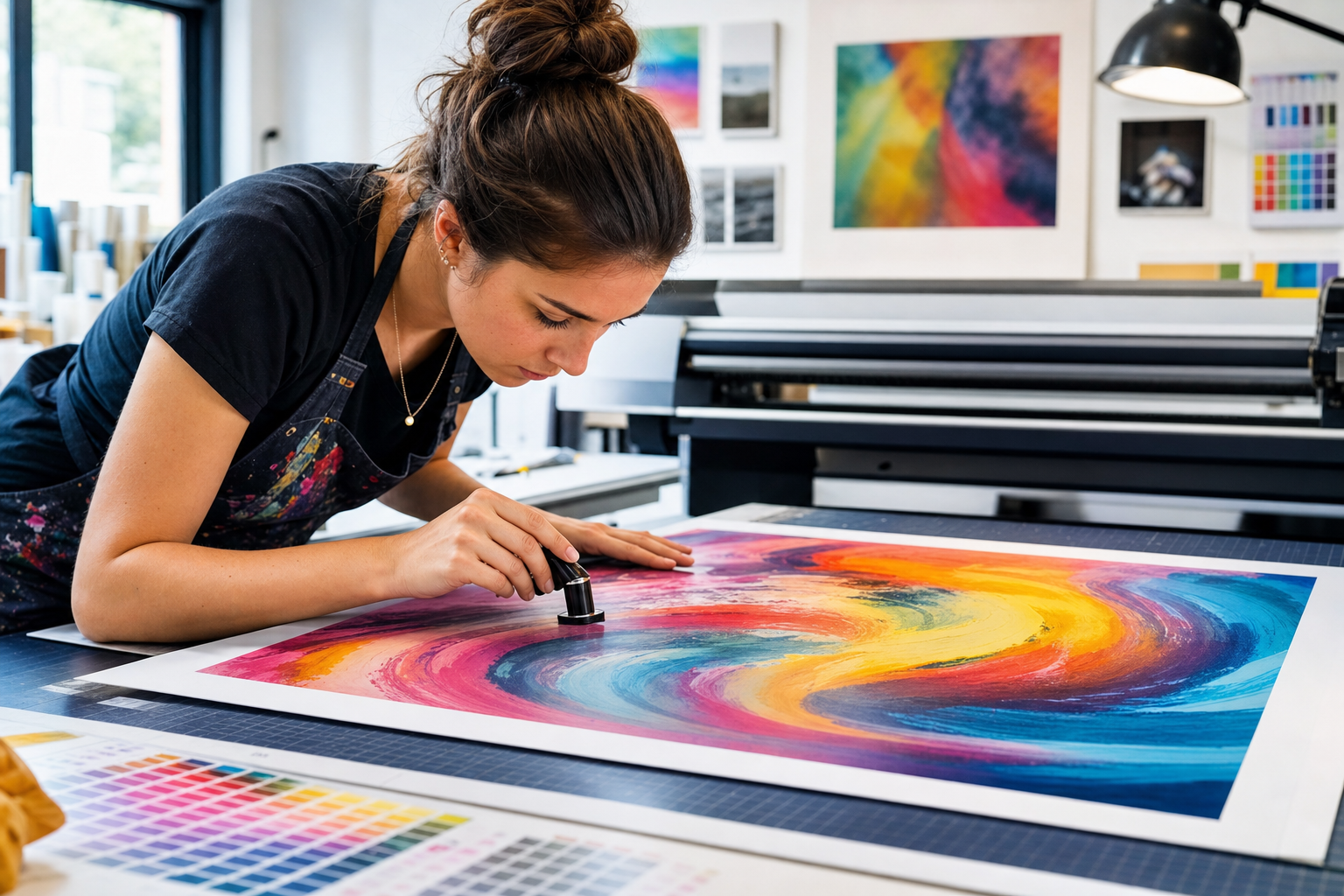
Do a final preflight before sending
A simple 2-minute review can catch expensive mistakes. Before you send the file, check:
- Spelling and phone numbers
- Dates, prices, and addresses
- Image resolution
- Bleed and crop area
- Correct colour mode
- Fonts embedded or outlined
- Layer visibility and hidden objects
- File naming, version number, and job reference
It is also smart to open the exported PDF and inspect it at 100 percent zoom. That lets you spot broken text, missing objects, or layout shifts before the printer does.
Practical conclusion
The best print files are not always the most creative, they are the most production-ready. By checking resolution, using vectors where possible, adding bleed, managing colour, and exporting correctly, you dramatically reduce the risk of reprints and delays.
For businesses, this means faster turnaround and better margins. For designers and clients, it means fewer surprises and a result that matches the brief more closely. A consistent preflight routine is one of the simplest ways to improve print quality across every job, from business cards to large format signage.
If you build it into your workflow now, you will save time on every project that comes after.
Great print starts with the right supplies and know how. Explore the wider Graphic Supplies health ecosystem.